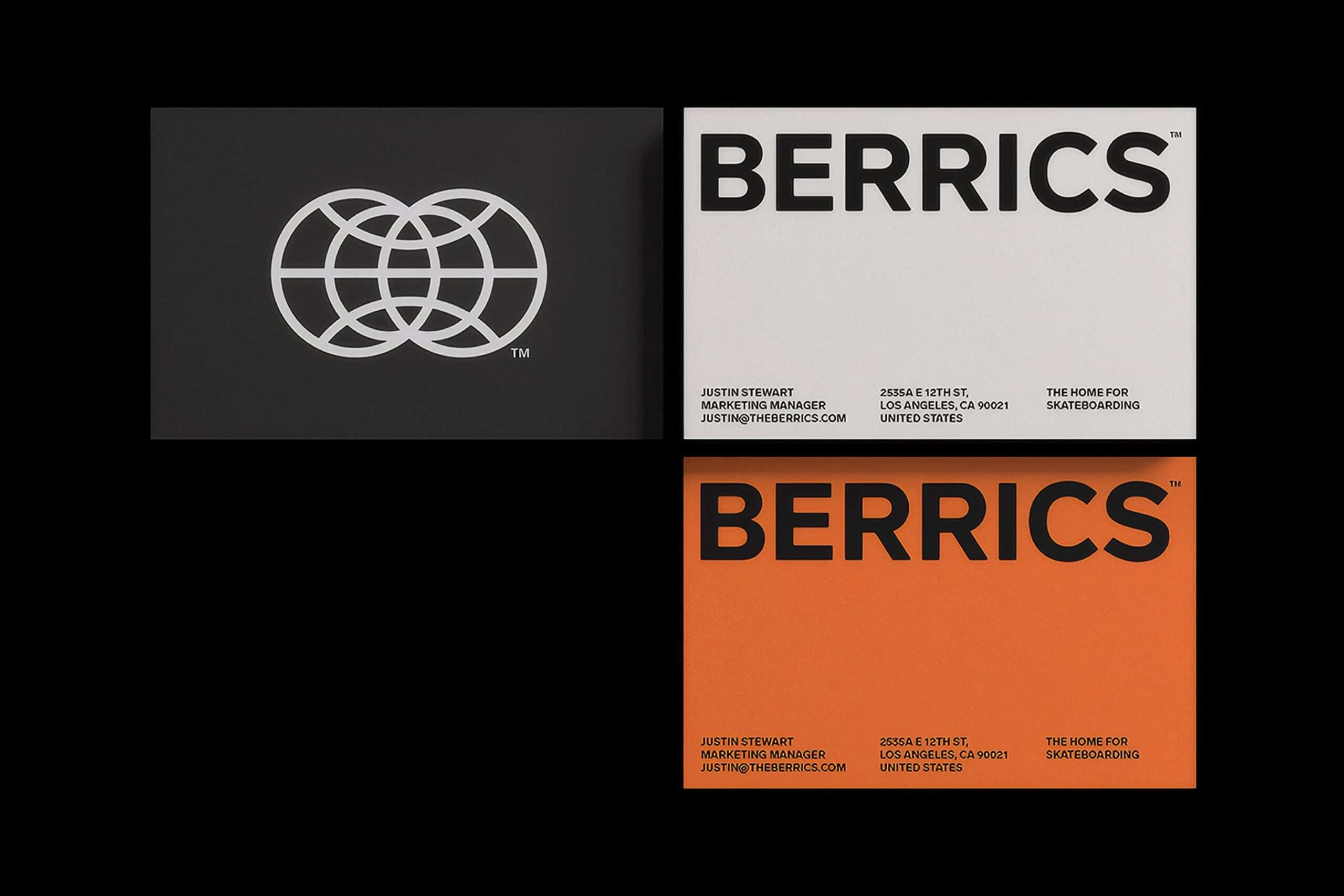
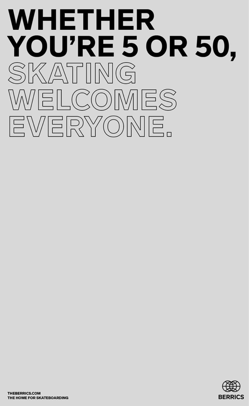
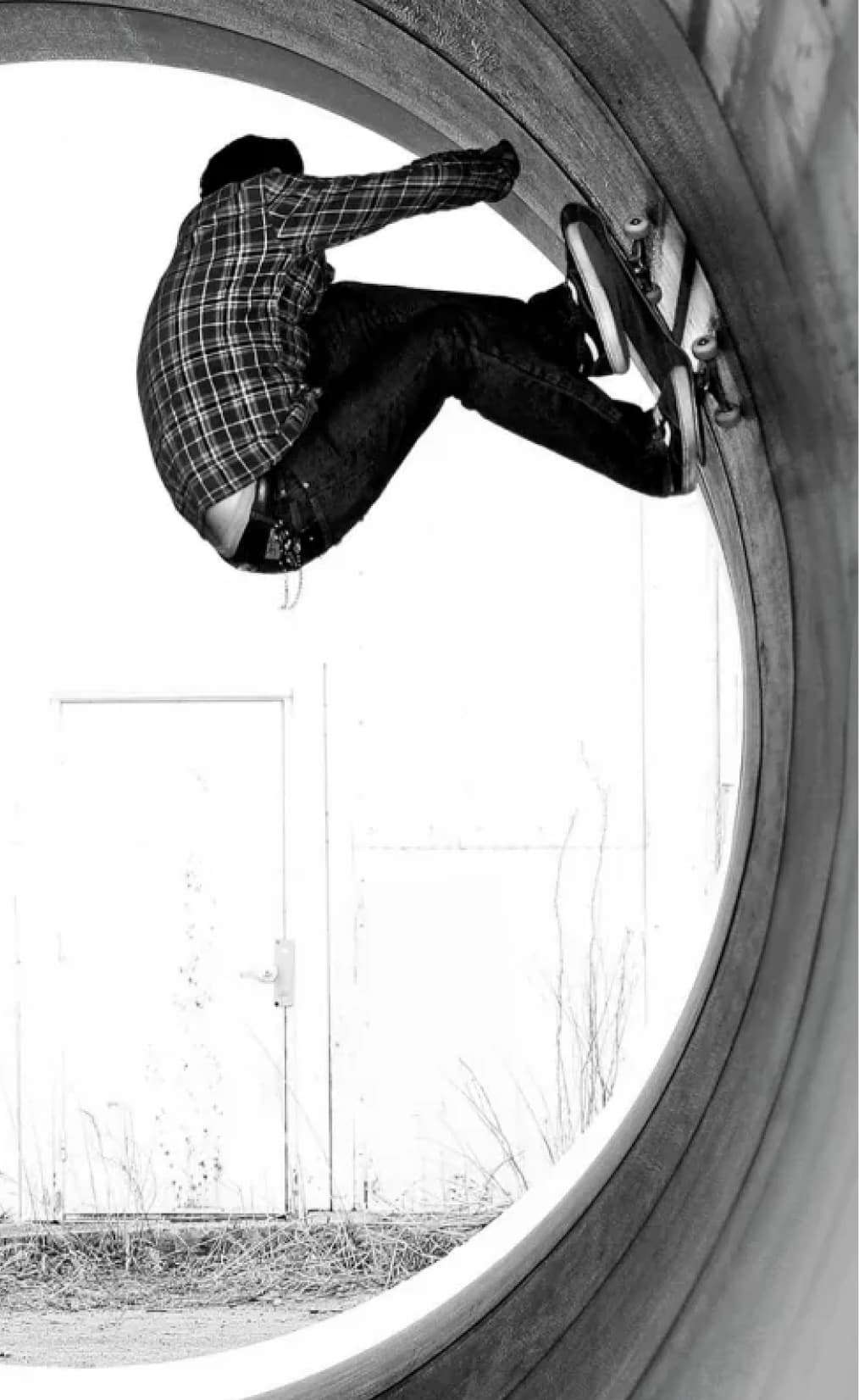
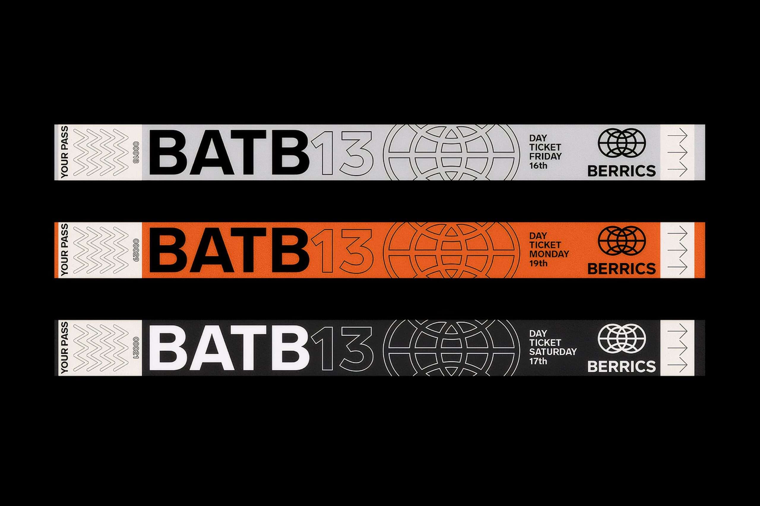
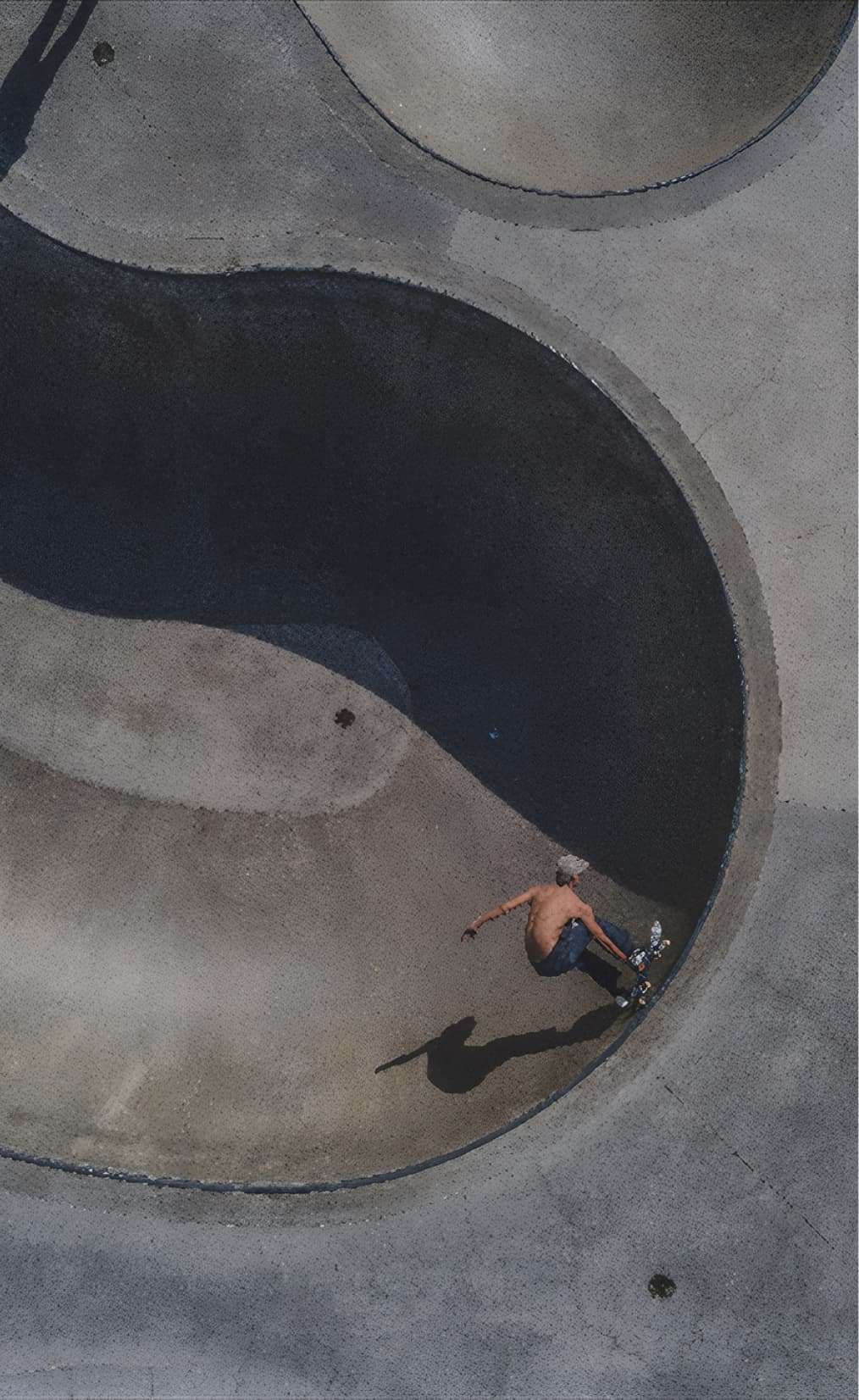
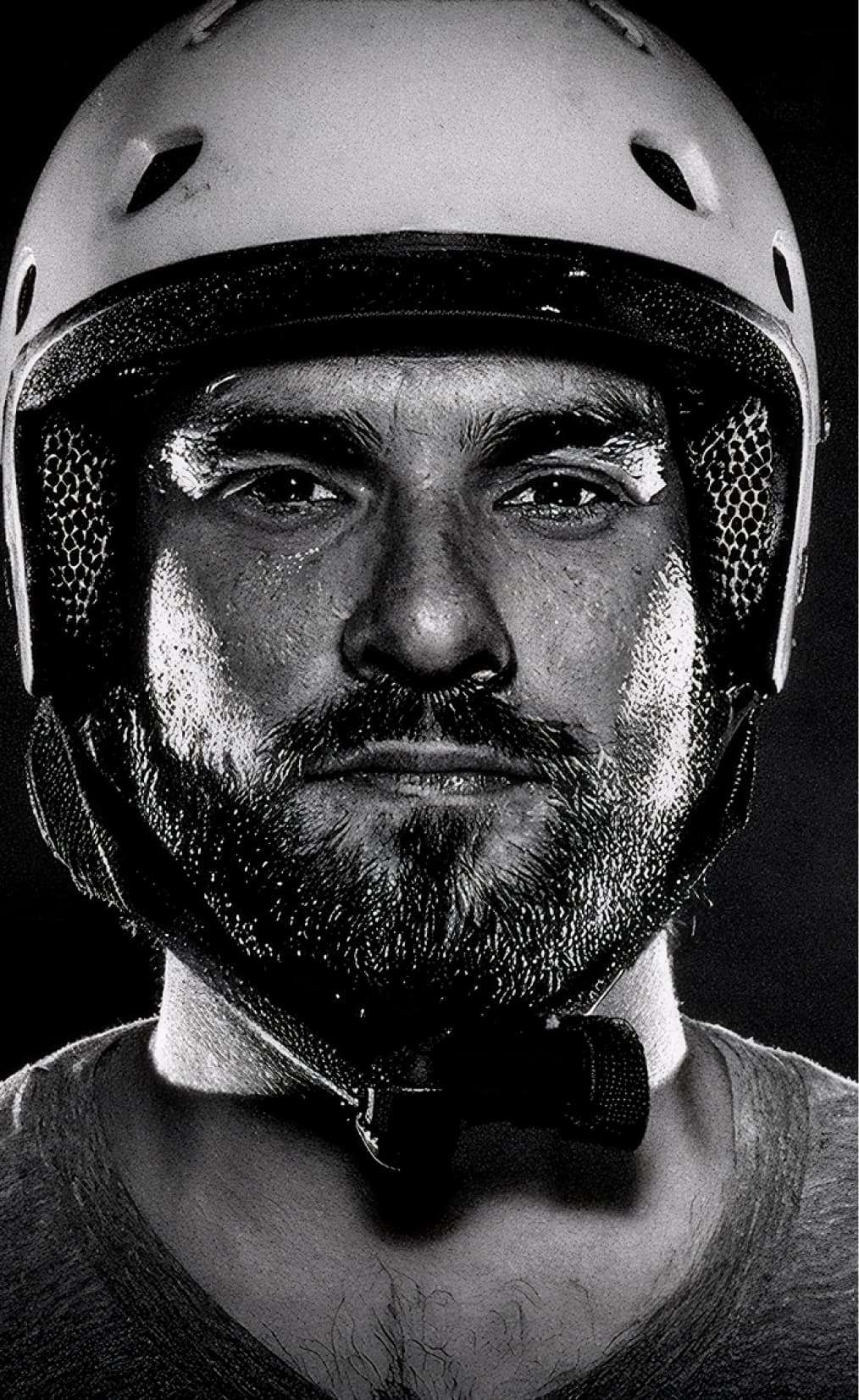
In the world of skateboarding, The Berrics is an undisputed reference. It began as a space dedicated to uniting the diverse skateboarding tribes in Los Angeles, California, and has since evolved into the world’s largest skateboarding media company.
The challenge was to create a new identity that would maintain the original symbolism of uniting different skateboarding tribes while distancing itself from the resemblance to the UN brand, which was a major concern for the group.
Building upon this foundation, a rebranding was carried out that incorporated the symbolism, keeping the globe from the original brand as a starting point but introducing the idea of two worlds merging.
Simple, versatile logo reflects unity and diversity at The Berrics’ core. Created for diverse product range, drawing from original brand. Examples showcase its adaptability and versatility.
Driving Consistency
A detailed brand manual was developed, establishing rules and best practices for the proper use of the new identity.
Building on this foundation, a rebranding effort introduced a logo that retained the original globe but reimagined it to symbolize the merging of two worlds.
The result is a simple, versatile logo that reflects the unity and diversity at Berrics’ core. Designed to cover a broad product range, it draws on the minimalism of the original brand while adding expressive touches.
In order to support the new brand, several practical implementations were created. Social media examples demonstrate consistent visual identity across channels.