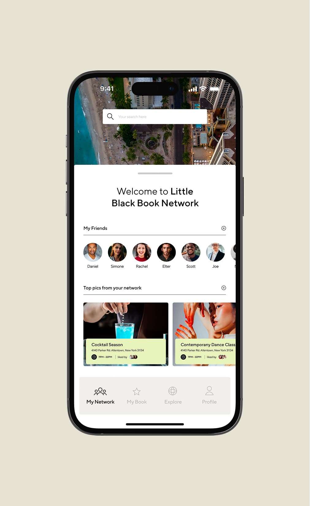
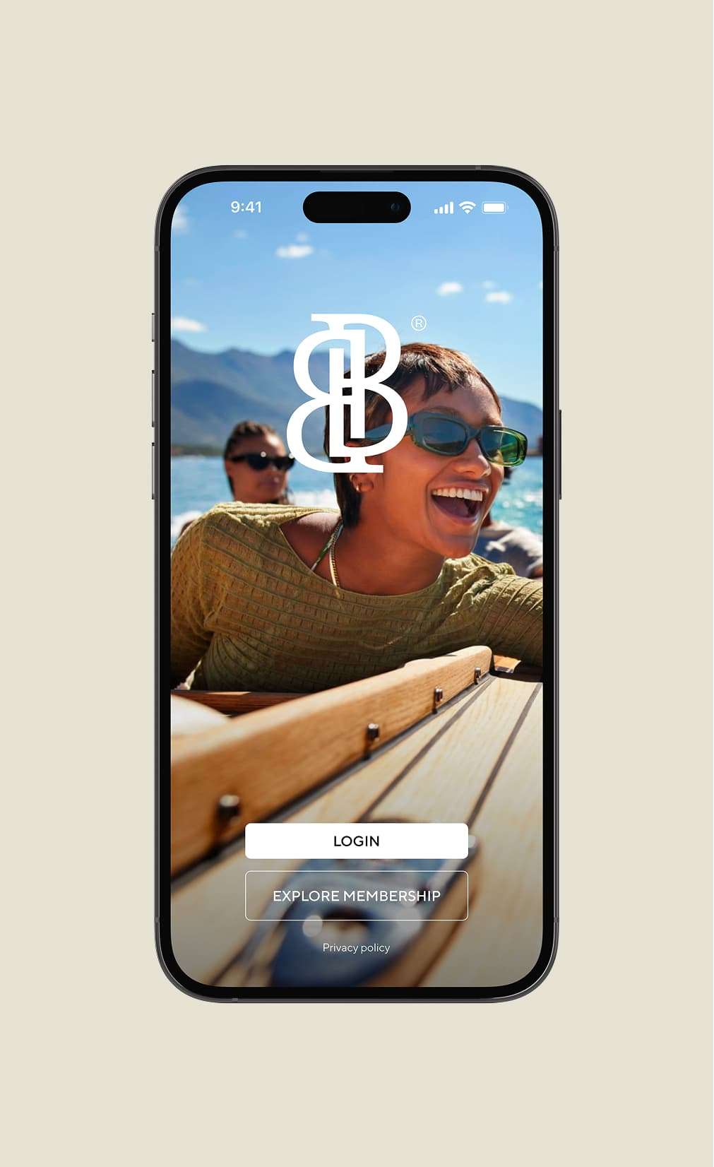
Little Black Book (LBB) emerges as a beacon of innovation, crafting a digital networking platform dedicated to empowering women by filling knowledge gaps. Collaborating with Flow agency, our challenge was to translate this vision into a visual identity that resonates with sophistication, simplicity, and the digital essence of LBB.
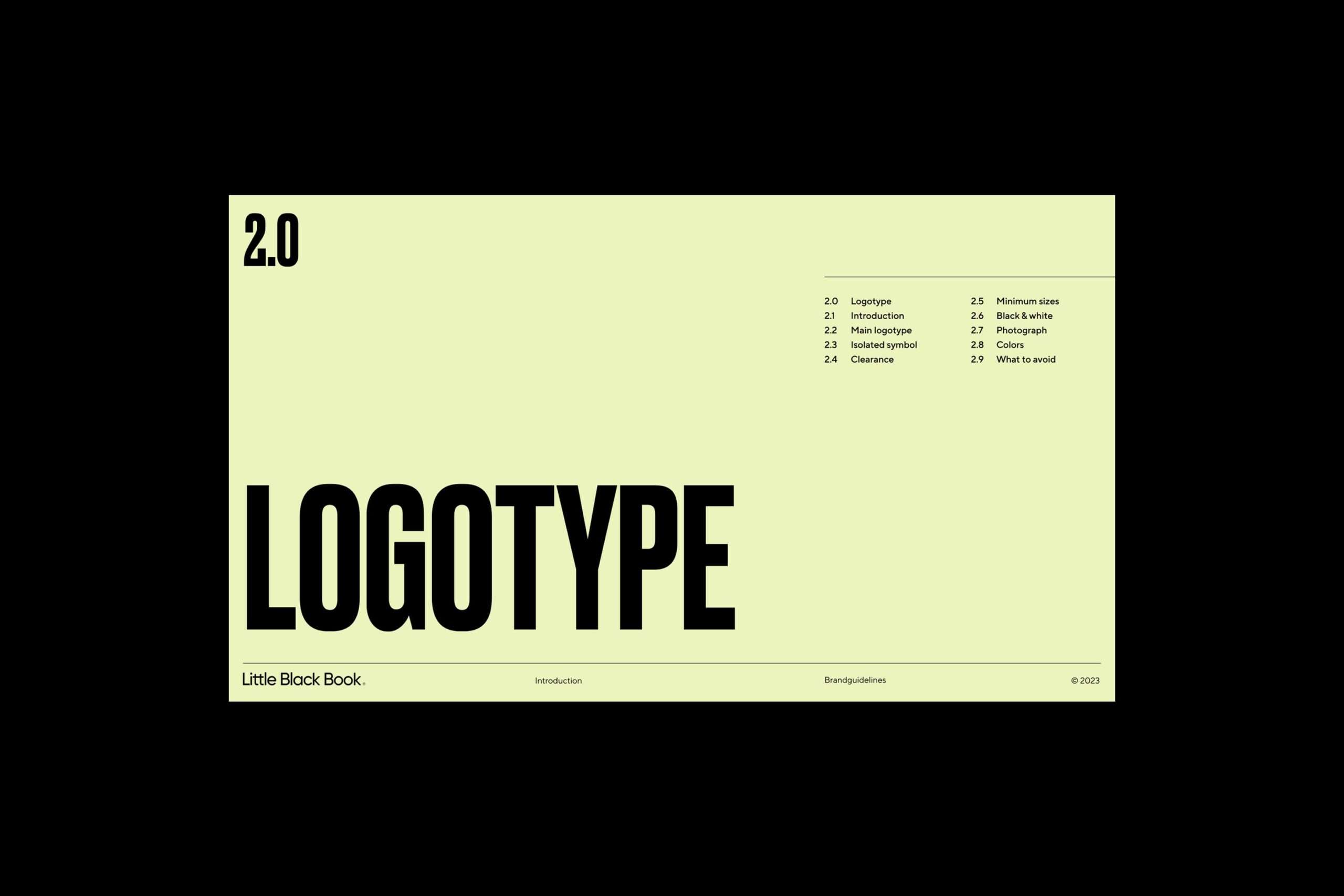
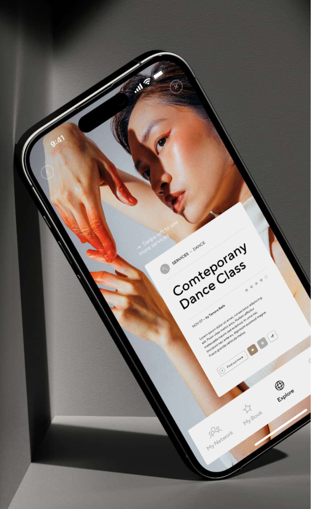
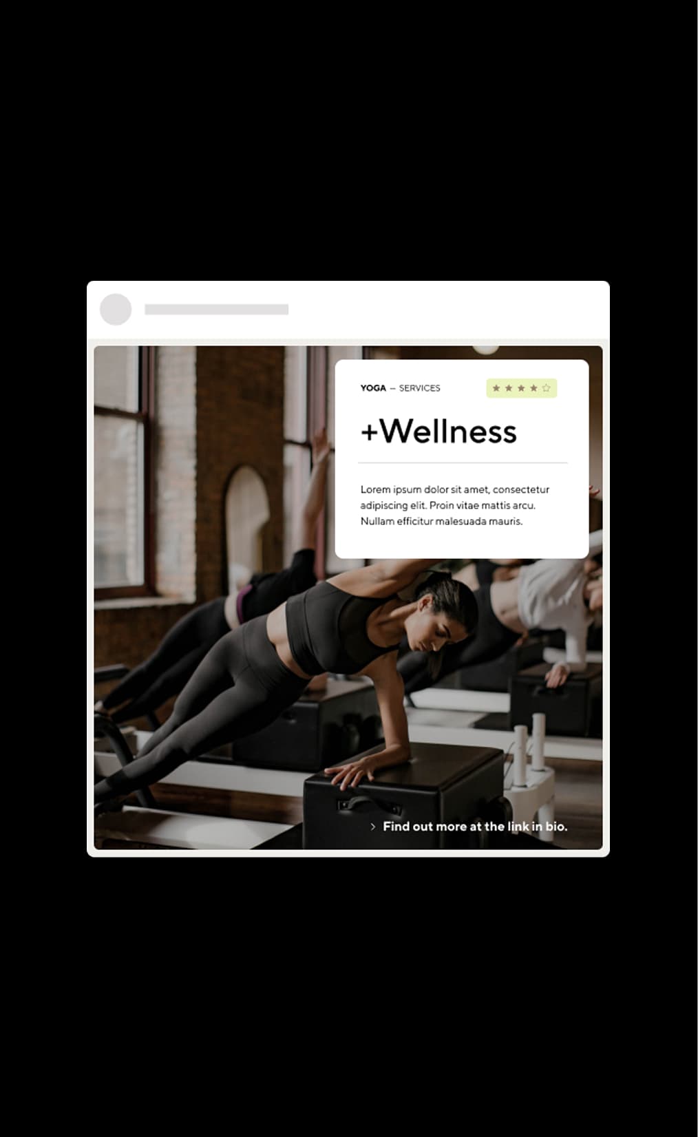
Our goal was to develop a brand identity that reflects LBB’s commitment to creating a trusted, efficient, and empowering digital ecosystem. This encompassed designing a typographic logo and monogram that embody elegance and modernity, alongside a visual identity that communicates through carefully selected images and color schemes.
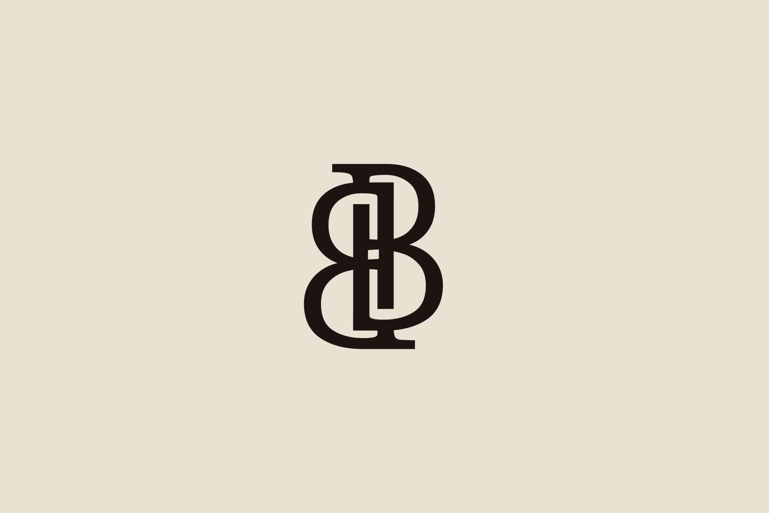
Typography & Elegance: We chose typefaces that strike a balance between sophistication and simplicity, ensuring elegance and readability across all mediums. This choice underscores the brand’s premium and accessible identity.
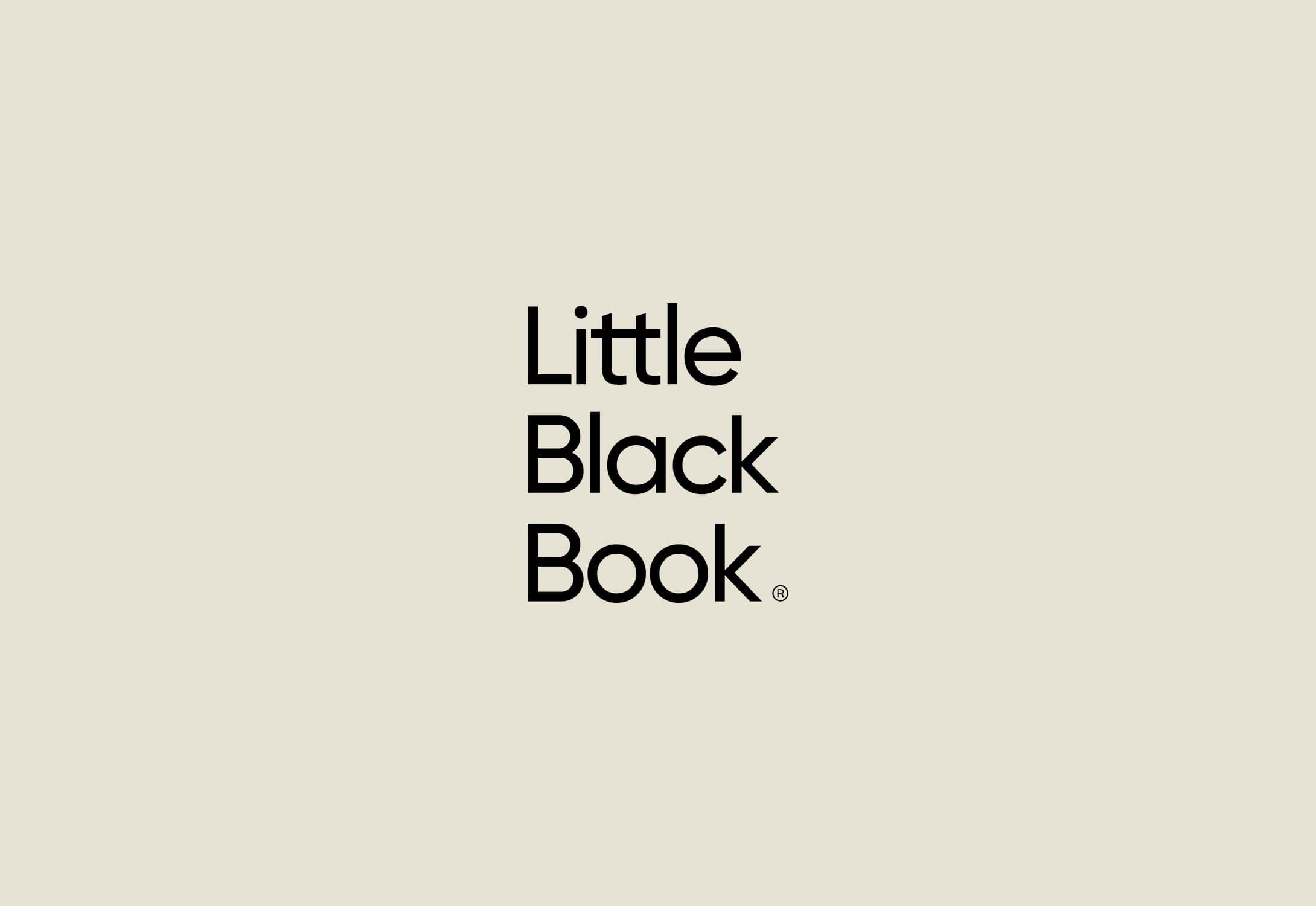

The “LBB” monogram was crafted to symbolize exclusivity and credibility, making the brand instantly recognizable. It stands as a testament to LBB’s unique position in the digital referral space.
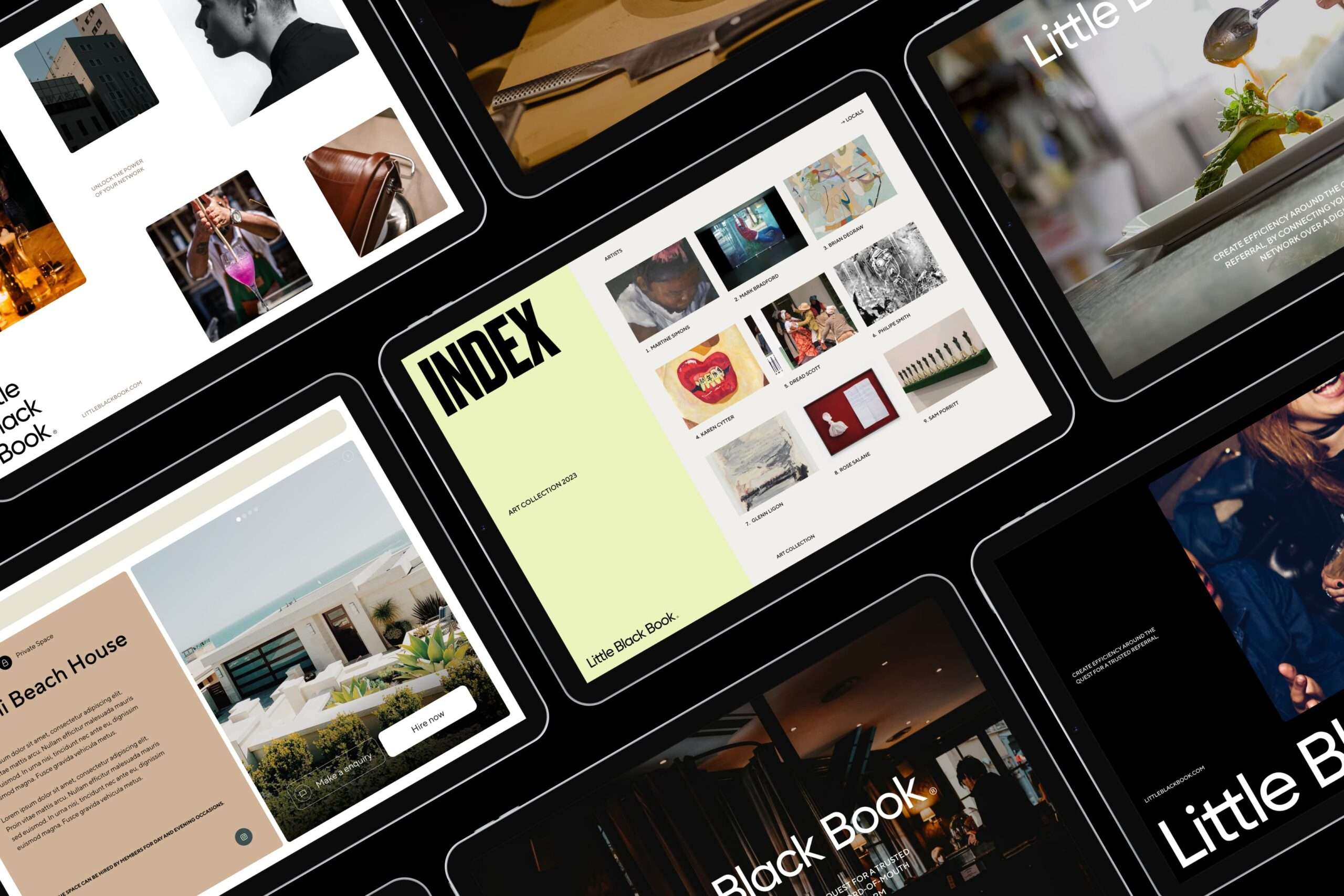
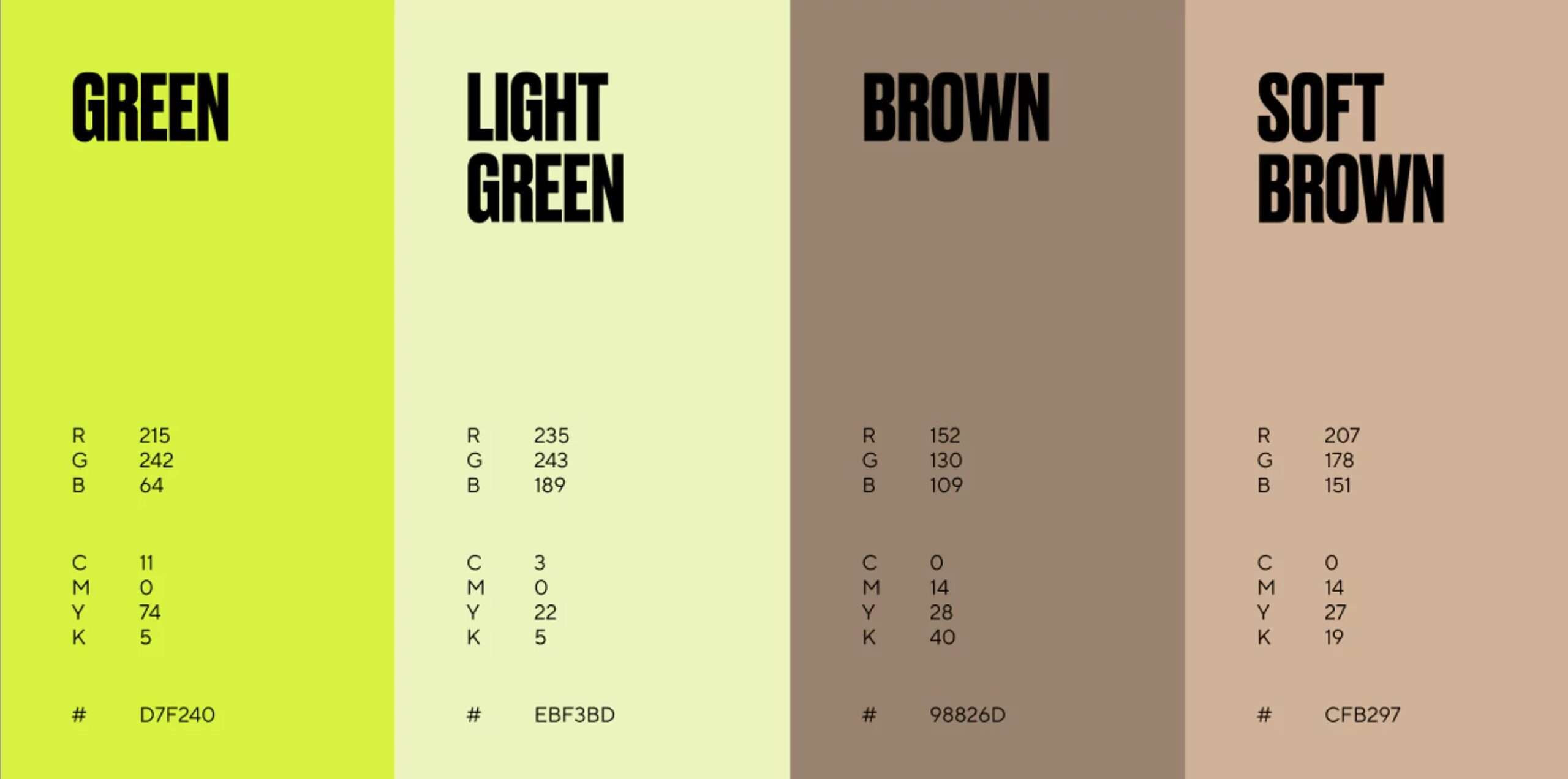
Our selection of black, white, and digital green serves as a visual anchor for the brand, offering a minimalist yet distinct identity. This palette was chosen to reflect LBB’s innovative approach and dedication to exclusivity.

By embracing minimalism and modernity, we’ve created a visual identity for Little Black Book that aligns with its mission to revolutionize the way consumers receive and obtain referrals. Our collaboration with Flow has resulted in a brand that is not only visually appealing but deeply rooted in the principles of trust, efficiency, and empowerment.
